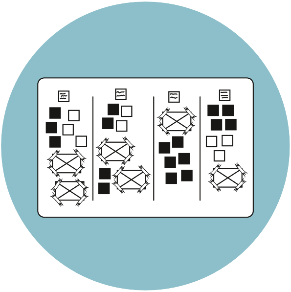
25. Clustering
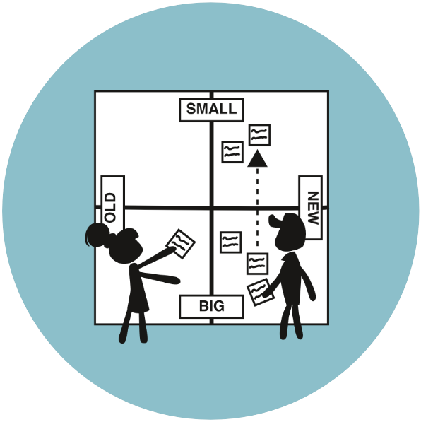
This method is a way of discovering what categories emerge from the research collected. You sort and place the collected information and research on a shared board, using closeness or distance to map out and clarify relationships and differences between research data in a visual and tangible way. This makes it easier to understand a subject and create new knowledge or develop ideas in project work.

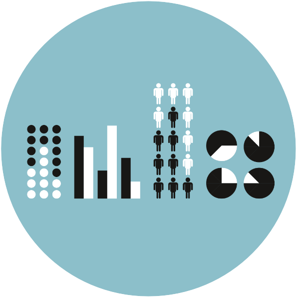
26. Visualising Data
A diagram, pie chart or other graphic elements that depict relationships or the relative size or percentage of something is often easier to grasp in one glance and communicate than a lot of data and statistics explained in a long and complicated text. Data visualisation can create new insights because the relationship and the categories and hierarchies are immediately visible. Graphics are also an excellent commu nication tool.

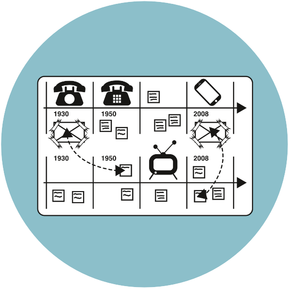
27. Biography
The biography method looks at the challenge and related subject areas and what has happened historically, finding relationships, topics and patterns in what has happened to better be able to understand what is going on today and also what might happen in the future. Learning from the past!

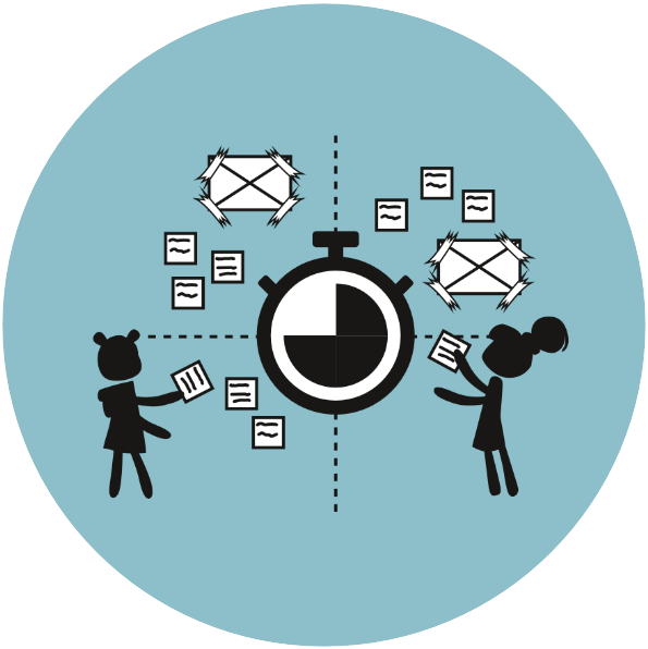
28. Day Cycle
The Day Cycle is quite simply a way of look ing at for example a phenomenon, a person’s activities or what is happening at a specific site during a day and then mapping those occurrences visually. This approach often uncovers challenges or patterns that might be interesting and relevant for your work or the challenge you are interested in.

30. Analytical Diagram
One way of analysing a set of elements, data and information is by organising and visually placing the elements collected in different diagrams: three overlapping circles, one axis or a double axis placed in a cross with opposite analytical criteria. The criteria emerge from the analysis of your research and what you find relevant to the challenge.
All FUTE project materials are licensed under CC BY-NC-SA 4.0
5C and 6C Models © Anne Katrine Gøtzsche Gelting and Silje K.A. Friis.

